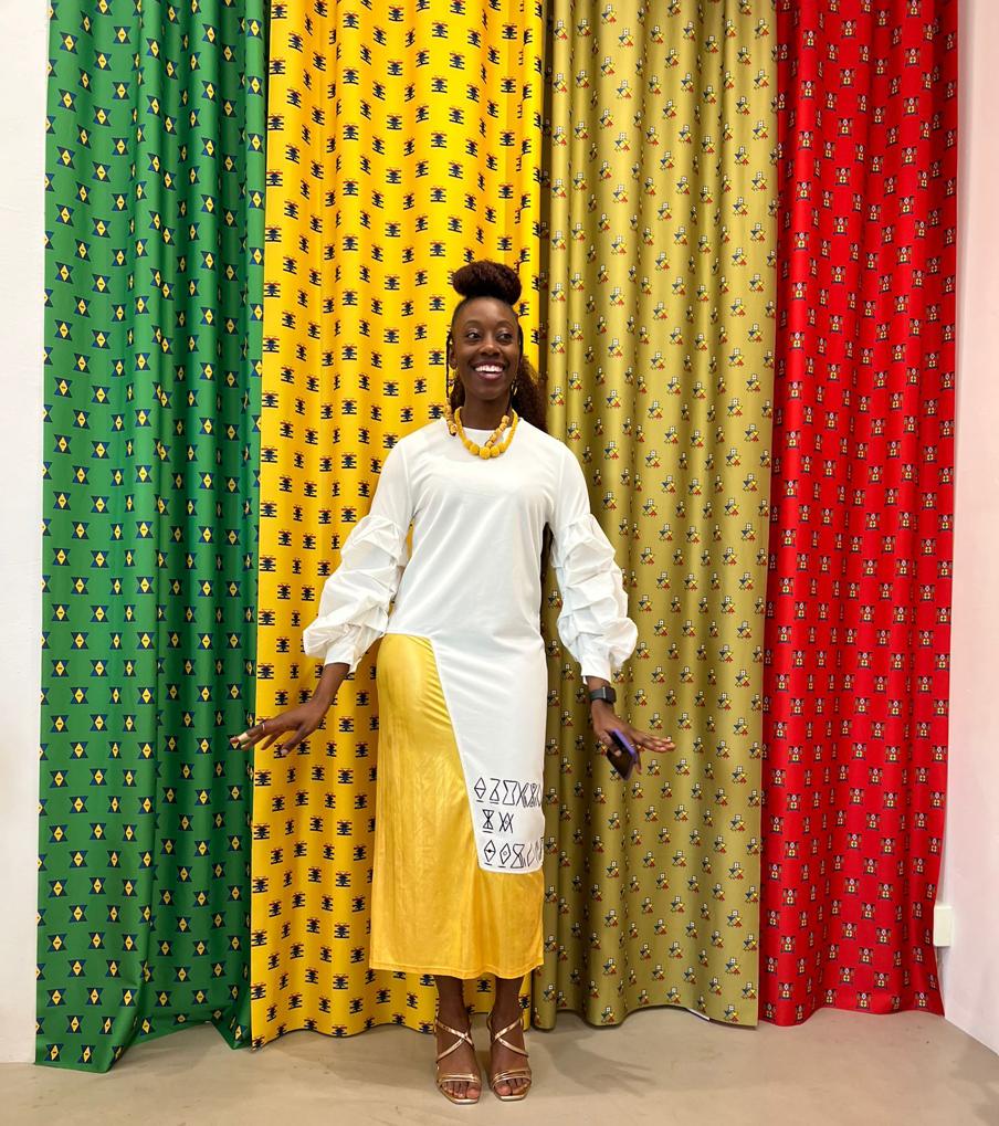
The Creatives Note caught up with Zimbabwean type designer, Taurai Valerie Mtake, to discuss how the Madimi one typeface project with Google Fonts came about and her experience designing the typeface.
TUNMISE AFAPE
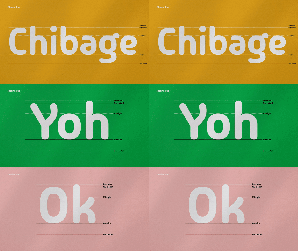
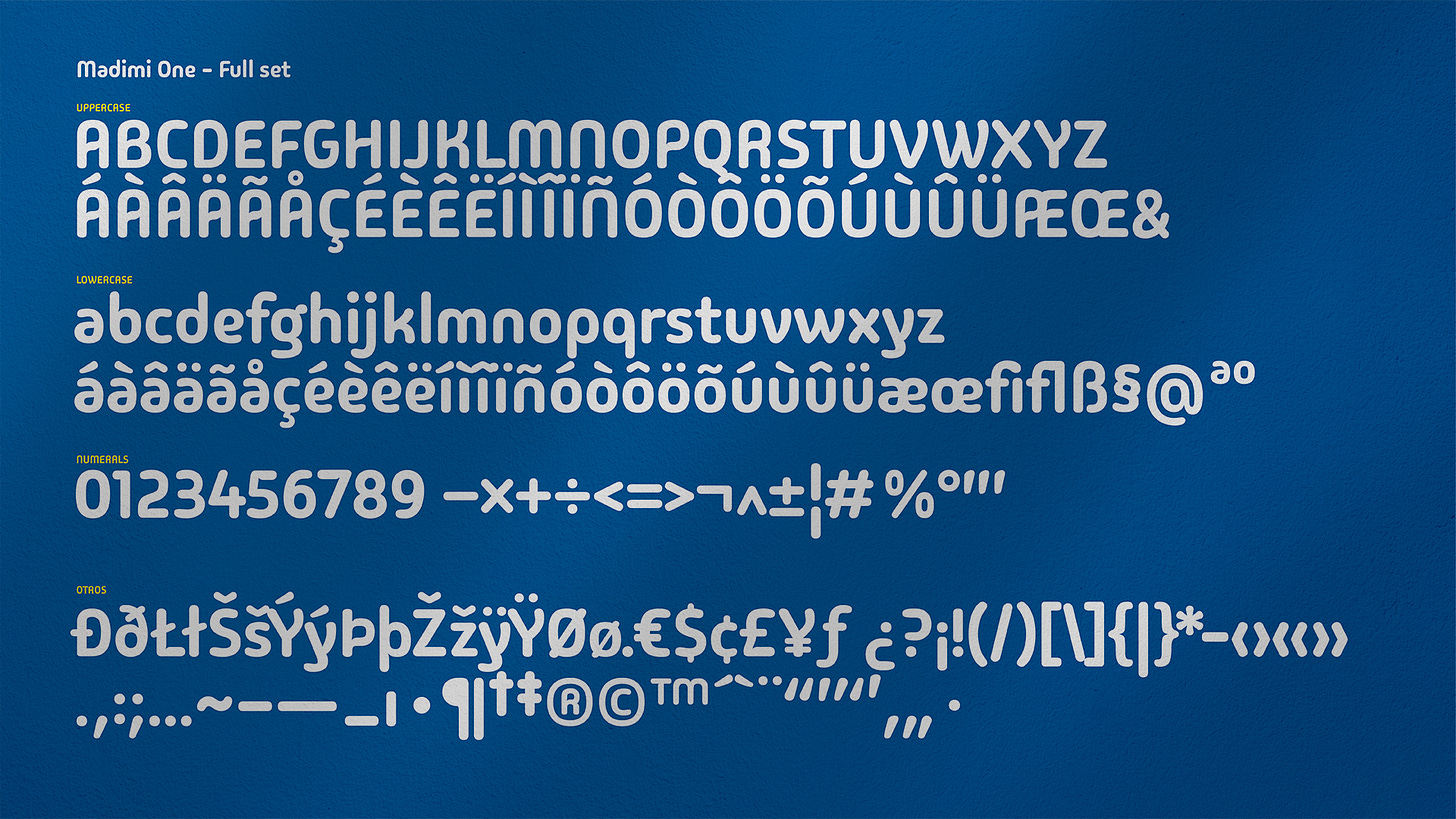
Two weeks ago, Google Fonts added two typefaces, made by a Nigerian designer and a Zimbabwean designer, to its catalogue of open-source fonts. One of the typefaces—Madimi One, a rounded sans with a mixed geometric and organic design—was created by Taurai Valerie Mtake, a Zimbabwean visual communicator and type designer.
Following the announcement, The Creatives Note caught up with Mtake, who is currently based in Sweden, to discuss how the project came about and her experience designing a typeface and working with the Google Fonts team.
The Origin of Madimi
In 2016, while looking for a project to work on for her thesis at the Greenside Design Center College of Design in South Africa, Mtake decided to create something meaningful that would allow her to apply everything she had learnt during her program. “My thesis needed to be a solution to a problem Africans face. I wanted to use the knowledge I had gained to create a solution to a problem I, as an African, faced,” Mtake tells The Creatives Note.
She had her lightbulb moment while watching a TED talk by Prof. Saki Mafundikwa, the author of ‘Afrikan Alphabets: The Story of Writing in Afrika’.
“In his TED talk, Prof Mafundikwa said, ‘It’s time for young African designers to start looking within Africa for inspiration,’ and that stuck with me because it dawned on me that when I and my friends go on Behance for inspiration, most of the designs we looked at for inspiration were not made for Africans or by Africans,” Mtake shares.
“So I picked up his book again to look for something to inspire me. I was looking for something much closer to home for inspiration and I stumbled on the page about Bantu Symbol Writing also known as Nguni symbols.”
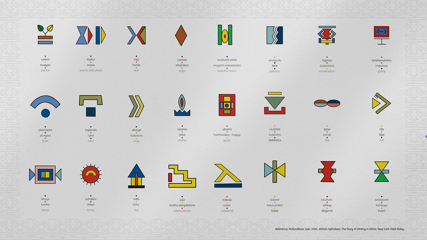
After stumbling on the Nguni symbols in the ‘Afrikan Alphabets’ book, Mtake decided to visit Dr. Esther Mahlangu, a South African artist whose paintings looked closely related to the symbols, to learn more about the symbols. “I went to see Dr. Mahlangu in her village to talk about the symbols, but unfortunately she didn’t know much about them,” says Mtake.
“This experience made me realise that the knowledge of these symbols is being lost. It touched me. How can this be? So I dug deeper and did more research. I found Dr Credo Mutwa, who was the first writer who wrote about them, but he got sick and eventually passed away before I could meet him.”
This didn’t stop Mtake as she met up with a couple of other script writers and linguists she could find to try to understand the history and origin of these symbols. “I also visited the Credo Mutwa Cultural Village in Soweto, South Africa. While I was doing this research, I realised that this project was bigger than I thought, and I had just about six months to come up with my thesis,” Mtake shares.
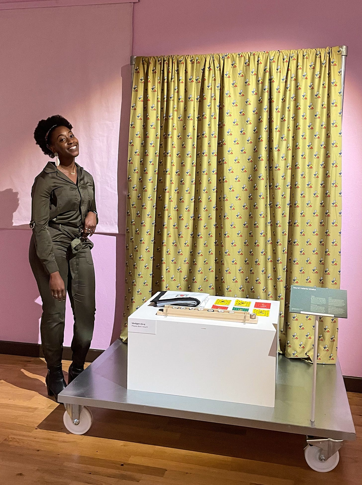
During this research, Mtake decided to write a book about these symbols and expand more on this symbol writing. She chose to look into the book ‘Indaba, my Children’ by Credo Mutwa to make people understand more about these symbols. “I wrote the book. But as a designer, I wanted to create something multifunctional, so the book had a game inside it. The book had perforated pages from which you can pull out the symbols to learn more about them in 3 languages; chiShona – which is my mother tongue, isiNdebele – another Zimbabwean main language, and the English language.”
Mtake challenged herself to create the game as a tool to teach her nephews, nieces, and other young people who were born and raised abroad about the language. “The idea was to use the game as a tool to preserve our culture. I used the game to modernise and digitise some of the games I used to play as a kid,” says Mtake. “So for the project, I wrote a book, made a board game, and a mobile app game as well – but I didn’t develop the mobile game at the time.”
From Symbol to Typeface
While working on the book, Mtake realised she couldn’t find the perfect typeface for her project. “I looked for typefaces that would work for my project but I couldn’t find any. So I just picked one to work with for the project but it still didn’t sit well with me,” Mtake reveals.
She decided to take matters into her own hands by creating a typeface of her own. “I started sketching a typeface even though I had just three months left to conclude the project. I sketched and visited Jan Erasmus, a South African type designer. He showed me his work and also showed me how type design is done. He warned me that type design takes time. Eventually, I abandoned the typeface design because I didn’t have much time and I was overwhelmed.”

After concluding her project (thesis), Mtake picked up the typeface sketch again. “After I published my project, I reached out to Sebastian Tapiwa Garikayi, a friend of mine who is a self-taught type designer, in 2017 – 2018, on how to go about digitising the typeface I had sketched while working on my thesis. Also, the sketch still needed to be refined.”
Working with the Google Fonts team
Seven years after publishing her Madimi project (thesis) in 2016, Mtake got a message inviting her to be a part of a type design project by Google Fonts. “Last year (2023), out of the blues, I was contacted by Simon Charwey, a very good friend of mine who is also a designer, and he was like, ‘Google is doing a project and they are looking for African type designers, would you like to be a part of this?’ and I said sure why not,” Mtake tells The Creatives Note.
“At the time, I had just concluded my Masters in Visual Communication and had just started an internship here in Sweden. So I decided to have a chat with Thomas and Dave who were commissioning me for this Google project to find out the details.
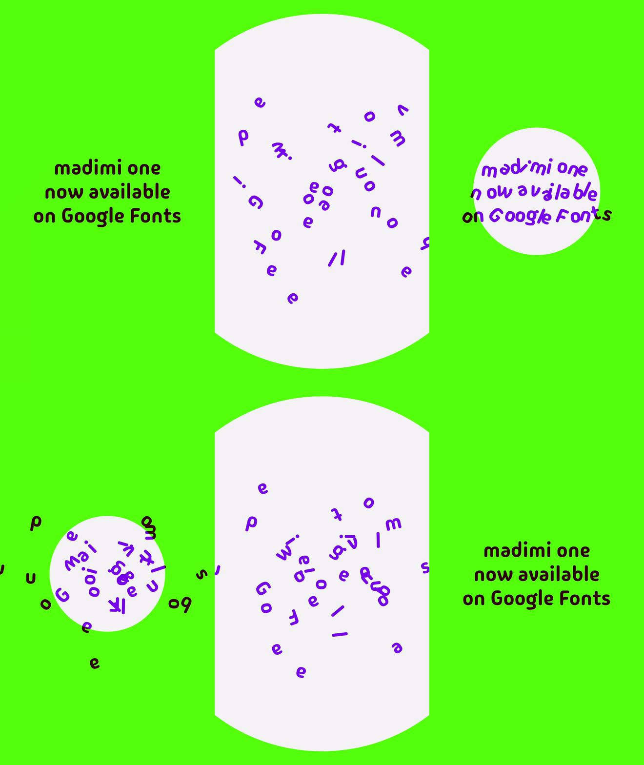
With guidance from the Google Fonts team, and mentoring and technical help from Laura Meseguer, Lisa Huang, and Mirko Velimirovic, Mtake worked on refining her original sketch. “After about 3 – 4 months of working on the project with the Google Fonts team, I managed to refine my original sketch and I am glad to see the result. It feels so surreal but I am happy to see a typeface inspired by Southern African symbols is now available on Google Fonts.” Mtake shares.
MORE FROM AFRICA NEWS 24
At the moment, Madimi has just one style but Mtake says she will keep working on the typeface to develop and make more styles available. “We only have the bold style available but I would love to keep working on developing more styles so that we can have options like Madimi Light, Madimi Heavy and so on.”
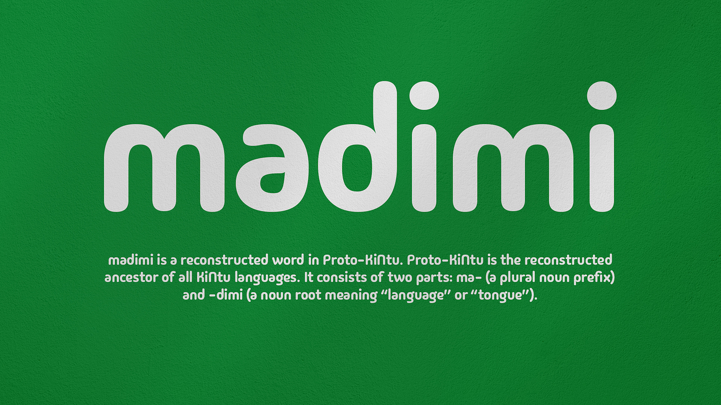
Speaking on what it was like working on a project of this scale, Mtake says, “It was a surreal feeling. I was like, ‘Is it really me? Am I really being asked to take on such a project for a company as big as Google?’ I was also like, ‘Yes it is me. I am one of the right people to come to for this project.’
“I felt a bit of imposter syndrome but with time I gained confidence in myself and it felt right. It felt good that my achievements and work were being noticed. It’s a dream come true.”
What Next?
Apart from releasing more styles for the Madimi family typeface, Mtake plans to publish two of the books she has written. “If I find the right and appropriate connections, I plan on publishing two of the books I’ve written,” she reveals.
“I also want to collaborate more extensively on projects that involve crafting and sharing African narratives, particularly those that have to do with Zimbabwean stories – but not limited to that,” Mtake shares.
“I believe that many African stories should be told by us [Africans] and not by others [non-Africans] because we will be able to tell them [our stories] better.
“I want to be more involved in projects that involve shaping the African narratives, especially in the areas of languages, cultures and branding.”
FIRST PUBLISHED BY: thecreativesnote


